10. Generation of graphics
Excel allows you to easily generate charts from data entered in a range of cells. To do this, simply select the range and use a command on the Insert tab of the ribbon.
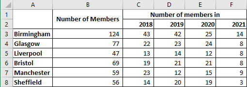
Let's use this cell range as an example:
10.1. 1st example of chart generation
Reproduce the extract from the spreadsheet above. Then :
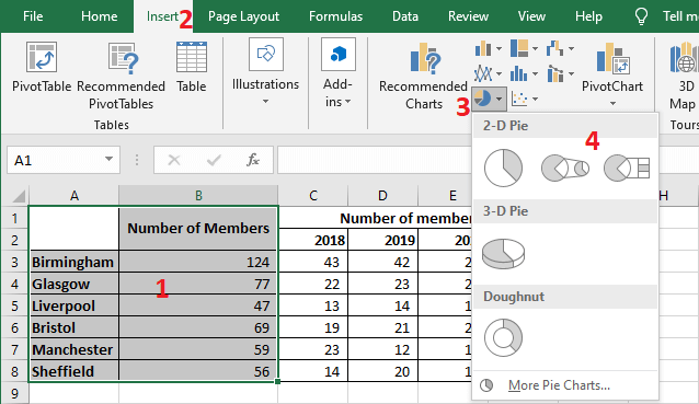
- Select the cell range A1:B8
- Click on the Insert tab of the ribbon
- Click on a command in the Charts group according to the type of chart you want. For example, the Insert Pie Chart or Doughnut Chart command.
- Choose a sub-type from the menu that appears.
A chart is generated according to the chosen type:
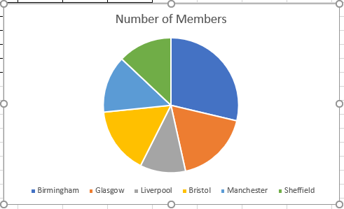
NB. Excel automatically changes the chart, as soon as you change values in the source data. Test this by changing values in the cell range B3:B8.
10.2. Another example of chart generation
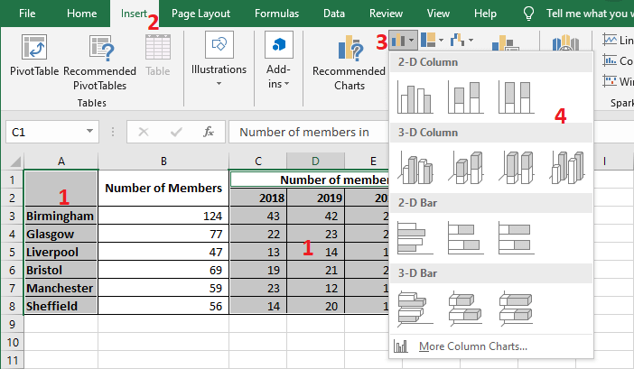
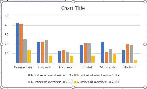
Excel offers a multitude of chart types. Here is another example with the histogram type and a multitude of data series:
- Select the cell range A1:A8, C1:F8
- Click on the Insert tab of the ribbon
- Click on the Insert Column or Bar Chart command.
- Choose a subtype from the menu that appears.
The generated graph is as follows:
Now notice that when you select a generated chart, Excel adds two tabs to the Ribbon, Design and Format, which disappear as soon as you click elsewhere. The commands in these two tabs are of course intended for customizing a generated chart.
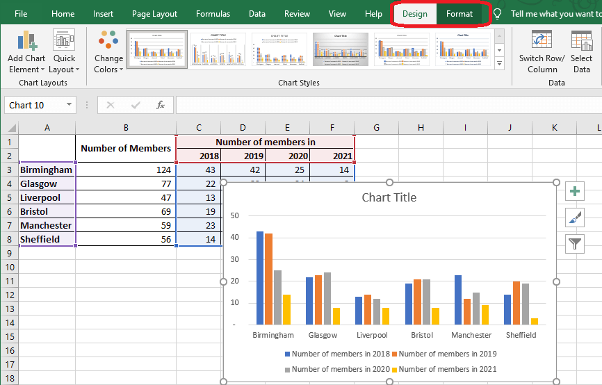
For example, you can select another color series or chart style using the buttons in the Chart Styles group on the Design tab of the Ribbon

10.3. Changing the type of a chart
You can change the type of a chart generated by Excel :
- Click on the chart you want to change its type
- Click on the Design tab of the ribbon
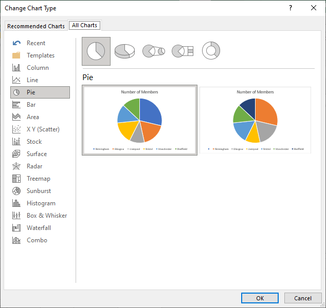
- Click on the Change Chart Type command to open the Change Chart Type dialog box

In the Change Chart Type dialog box:
- Select a chart type in the left pane
- Then select a sub-type in the right pane
- Validate by clicking on the OK button.
10.4. Selecting the data of a chart
Remember that if I change the values of the source data of a chart, then the chart is automatically updated by Excel.
On the other hand, if I need to modify the range of cells of the source data or add another series of data, I can proceed in one of the two following ways:
1st method:
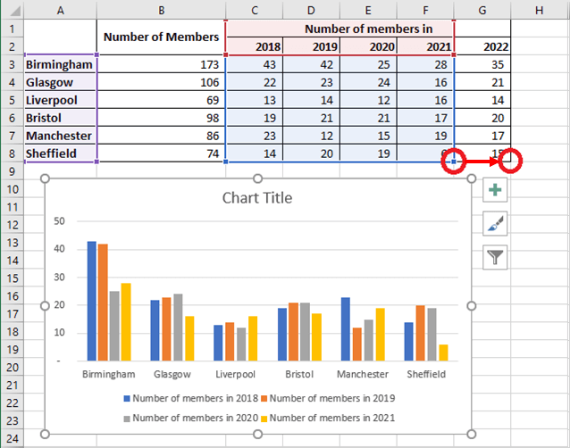
- Click on the chart for which you want to select the source data. Excel highlights the source data for that chart
- Click on a corner of the selection, the pointer should be of this shape
 . Then, click and hold the mouse pointer until the selection includes all the data you want to include as a data source.
2nd method:
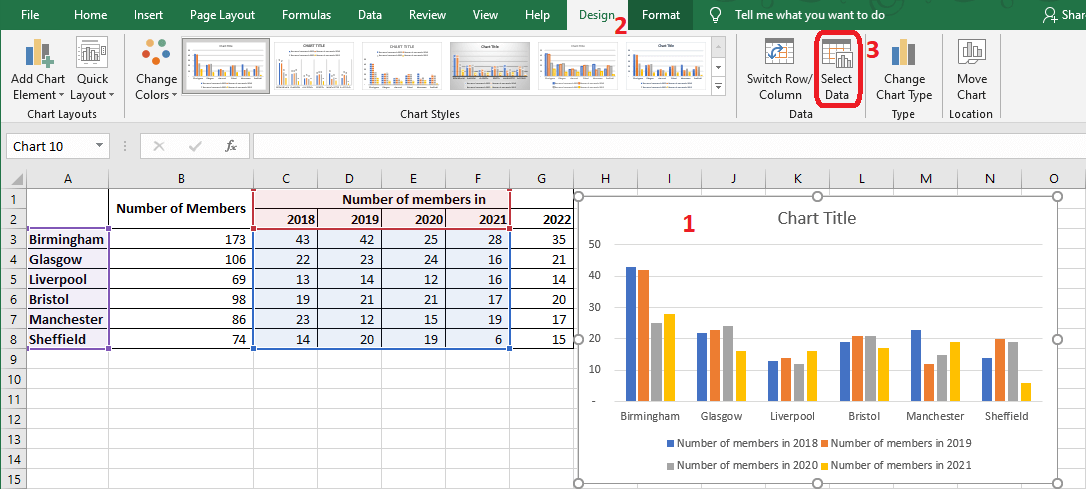
- Click on the chart you want to modify
- Click on the Design tab of the ribbon
- Click on the Select Data command to open the Select Data Source dialog box
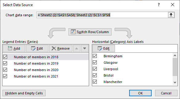
The Select Data Source dialog box gives you advanced options to :
- Add or modify a data series
- Modify the labels of the horizontal axis
In this case, if we just want to change the range of cells in the data source, all we have to do is :
- Click on the Chart data range field
- Select the data source cell range on the sheet
10.5. Add a graphic element
You can add, delete or change the position of various elements in a graphic:
- Click on the graphic you want to modify
- Click on the Design tab of the ribbon
- Click on the Add Chart Element command to see the corresponding menu appear

I invite you to test each of the menu commands. Excel immediately shows the effect on the chart when you move the mouse pointer over each of these commands.